Group 4: Women's Foundation of Boston
Emily Liu, Emaan Shah, Riva Shukla, Joshua Newstadt

Image of girls impacted by WFB
Image of girls impacted by WFB
The Women’s Foundation of Boston (WFBoston) is dedicated to promoting the well-being of women and girls in the Greater Boston Area. They help build and sustain organizations and programs that are designed to economically empower women for the future. A large focus of these programs is to develop STEM and leadership skills. The aim of our project is to present the ways that the Women’s Foundation of Boston has impacted not just Boston, but all of Massachusetts. Our goal is to create an effective visualization to show the various demographics and areas in which they have had an impact. Additionally, we hope to display quotes and anecdotes from women and girls who have participated in the program. This will allow us to highlight the impact of the Women’s Foundation that the numbers don’t show.
Our project is focused on two datasets provided by the Women’s Foundation of Boston.
These datasets consist of the total participants funded and the demographics (race/ethnicity and
stage of life) for every organization that WFBoston works with, as well as quotes from members
of the same organizations mentioned in the first dataset. The dataset of demographics contains
categorical data due to the organization name and program name, as well as quantitative data that
represents the number of participants and proportions of the race/ethnicity and age groups helped
in each organization. The second dataset only contains categorical data since it has organization
name, “quotes and anecdotes”, and “skills, mindset and knowledge changes.”
The goal of our project is to highlight the impact WFBoston has had on the Greater
Boston area. To accomplish this goal, we want to display the number of organizations they have
partnered with and women/girls they have aided, as well as the age groups and race/ethnicities of
people that have been impacted by the foundation.
We also want to display the anecdotes of the girls and women helped so the visualization
includes accounts from real girls and women whose lives have changed for the better because of
the organization. By combining the qualitative and quantitative data sets, we believe this new
data set will allow us to create an effective visualization.
For the dataset with the demographics of the girls and womens helped, we needed to
round all the decimal values to whole numbers since you can’t count part of a person. The reason
why we had to do this is because if WFBoston only provided ⅓ of the funding for a program for
100 participants, the organization can only say they impacted ⅓ of the 100 participants, or 33.3
girls or womens. For the data set of quotes and anecdotes, it was a bit more messy than the other
datasets provided since it is difficult to organize sentences in a more systematic manner. Since
we plan on making a word cloud for every organization, we needed to combine all the quotes
together for every organization into a long string so the word cloud Python library could count
the frequencies of every word in the given organization’s string.
During our interview with Annie Tallas and Patti Satterthwaite from the Women's
Foundation of Boston, we gained a comprehensive understanding of the organization's daily
operations and the data they'll be sharing with us. We found the interview to be very informative
and useful in shaping our project for WFB.
In addition, we received clear guidance on the visual style and content expectations for
the data visualization. We'll be focusing on the growth of the organization while keeping the
visualization professional yet accessible to both board members and the general public.
From our data, we can see that most of the women assisted by the foundation by far are
members of the Black or Latina communities. On the other hand, the smallest group helped were
women that identify at Native American. It is also evident that the greatest number of females
impacted by WFBoston are in the elementary school group, approximately ages 5-12, while the least
are in college, which is around ages 18-22.
From a geographical viewpoint, Suffolk County has the greatest number of programs.
This makes sense since Boston is located in Suffolk County and it is where the organization is
based. The two counties that follow Suffolk in terms of the number of programs are Essex and
Middlesex, which both border Suffolk. However, the other county that borders Suffolk, which is
Norfolk, does not contain a high number of programs like we predicted. Instead, Worcester,
which is further west, contains the fourth greatest amount.
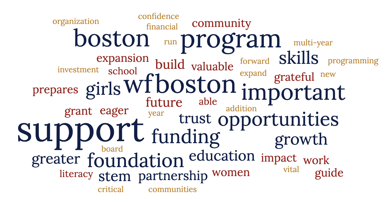
To get a grasp on the qualitative information we attempted to find some trends in the data
that was given to us. We wanted to see if the values that are important to WFBoston showed up in the
quotes and anecdotes from their partners. Through our visualizations we were glad to find words
like “girls”, “learned”, “loved”, “science”, and “positive” were common across the organizations.
However, there were some common words such as “program” that dilute the effect of the
visualization
When analyzing our data, we realized we had a lot of data points and categories to sort
through. To break down the information we were given, we decided to make a few visualizations
explaining different aspects of the data.
Our first static visualization is a map of Massachusetts highlighting the areas where WFB
has had an impact. The areas where WFBoston has had an impact are identified by markers or pins on
the map, which may be color-coded to represent different programs or demographic groups. The
design process for the map of Massachusetts began with the identification of the areas where
WFBoston has had an impact. We experimented with different markers and color-coding options to
ensure that the map was easy to read and provided a clear visual representation of the data. The
zooming and brushing/linking interactions were added to provide additional functionality to the
visualization and make it more user-friendly.
The map enables the viewer to understand the geographic reach of WFBoston and to identify
areas where the organization has had a significant impact. Zooming in and out on the map
provides the viewer with the ability to focus on specific areas of interest and gain a more detailed
understanding of the data.
The word cloud is a visual representation of the key themes of WFBoston programs. The
words are displayed in a way that reflects their importance or frequency, with the most important
or frequently used words appearing larger than others. The design process for the word cloud
began with an analysis of the text data associated with WFBoston programs. This included an
examination of program descriptions, mission statements, and testimonials from program
participants. Once the text data was organized and analyzed, we created the visualization. The
team experimented with different fonts, colors, and layouts to determine the best way to visually
represent the data. The word cloud was designed to be used in combination with the other
visualizations to provide a more comprehensive understanding of the data.
The word cloud provides a quick and easy way for the viewer to understand the primary
focus of WFBoston programs and the key themes that drive the organization's mission. While there are
no specific interactions or interactive components associated with the word cloud, it can be used
in combination with the other visualizations to provide a more comprehensive understanding of
the data. For example, the word cloud can be used to highlight the specific themes associated
with different demographic groups or geographic locations, providing additional insight into the
ways that WFBoston is impacting the lives of women and girls.
Our third visualization was a bar chart, which is a visual representation of the
percentage of different demographics served by the Women's Foundation of Boston (WFB). Each
demographic group is represented by a bar, with the height of the bar indicating the number of participants
of that demographic served by WFB. The
design process for the bar charts began with an analysis of the available data on the
demographics served by WFB. This included an examination of demographic categories such as
age, race, income, and education level. Once the data was organized and analyzed, we created
the chart. We experimented with different colors and layouts of the bars to determine the best
way to visually represent the data. The hover-over effect and click-to-highlight interactions were
added to provide additional functionality to the visualization and make it more user-friendly.
The bar charts enable the viewer to quickly and easily identify the programs that WFBoston funded and the demographic
groups that are most heavily served by the organize and helps to illustrate the foundation's
commitment to promoting the well-being of women and girls. The hover-over effect on the
bar chart provides additional information to the viewer by displaying specific numbers for
each program. This allows the viewer to better understand the magnitude of the
impact on each group. Clicking on a bar in the chart highlights areas on the demographic charts where
programs serving those group are, providing additional insight into the reach of
WFBoston.
First Visualization
These visualizations show the programs helped by WFBoston organized by county. In conjunction, they highlight the large impact that the organization has had on communities throughout Massachusetts. Click on different points on the map to see in the bar chart how many programs helped by WFBoston are located in that county. Click on different bars to see where that county is located on the map. Hover over different points on the map to see the county name and name of programs helped.
Second Visualization
The first bar chart displays the total number of participants funded by WFBoston within each program. The x-axis contains the number of participants while the y-axis holds the name of each program. Users can hover over a bar to see the exact number of participants in a program. Additionally, to see the race/ethnicity and age breakdown of a specific program, users can click on the bar and the other two charts will change accordingly.
The second chart displays the number of participants impacted, which are divided by different ethnicity/race groups. The x-axis has the different groups, and the y-axis represents the number of participants. Users can hover over a bar to see the different programs that serve that group.
The third chart also displays the number of participants impacted, but this time divided by different stages of life. The x-axis represents the different age groups, and the y-axis has the number of participants. Users can hover over a bar to see the different programs that serve that group.
Third Visualization
This visualization displays the words that have been used to describe the work that the Women's Foundation of Boston has done. The bigger the word, the more often it has come up when speaking about the foundation.
Through this project, we gained valuable insights into the impact of the Women's Foundation of Boston throughout Massachusetts. The visualizations created using the provided data helped to highlight the areas where WFBoston has made the most impact, the demographics of the women and girls assisted, and the positive changes that the organization has brought about in their lives. From the data, it’s clear that WFBoston has made a significant impact on many minority communities, especially the Black and Latina communities, as well as various age groups, with a focus on the elementary school-aged group (ages 5-12). Furthermore, our visualizations show the multiple organizations that WFBoston has partnered with, the majority of programs being located in Suffolk, Essex, and Middlesex County. This indicates that the foundation has a broad reach throughout the state and is dedicated to making an impact beyond the immediate Boston area. The qualitative data obtained from quotes and anecdotes from women and girls who have benefited from WFBoston’s program also showed positive trends, with common words like “learned”, “STEM”, “positive”, and “skills'' being prominent across the organizations. This suggests that the foundation’s focus on STEM and leadership skills development has inspired the many girls and women they work with. Overall, the visualizations created in this project highlight the foundation’s dedication to the economic empowerment of women and girls, particularly those in underrepresented communities. The insights gained from this project can help WFBoston with their future endeavors in continuing to make a positive impact on the lives of women and girls in Massachusetts.